ORGANIZATION/LEGAL
Successfully implemented wallet compliance conditions
FINANCIAL
Saved on SVF licensing and regulatory expenses
CUSTOMER SUCCESS
Positive driver testimonials on messaging
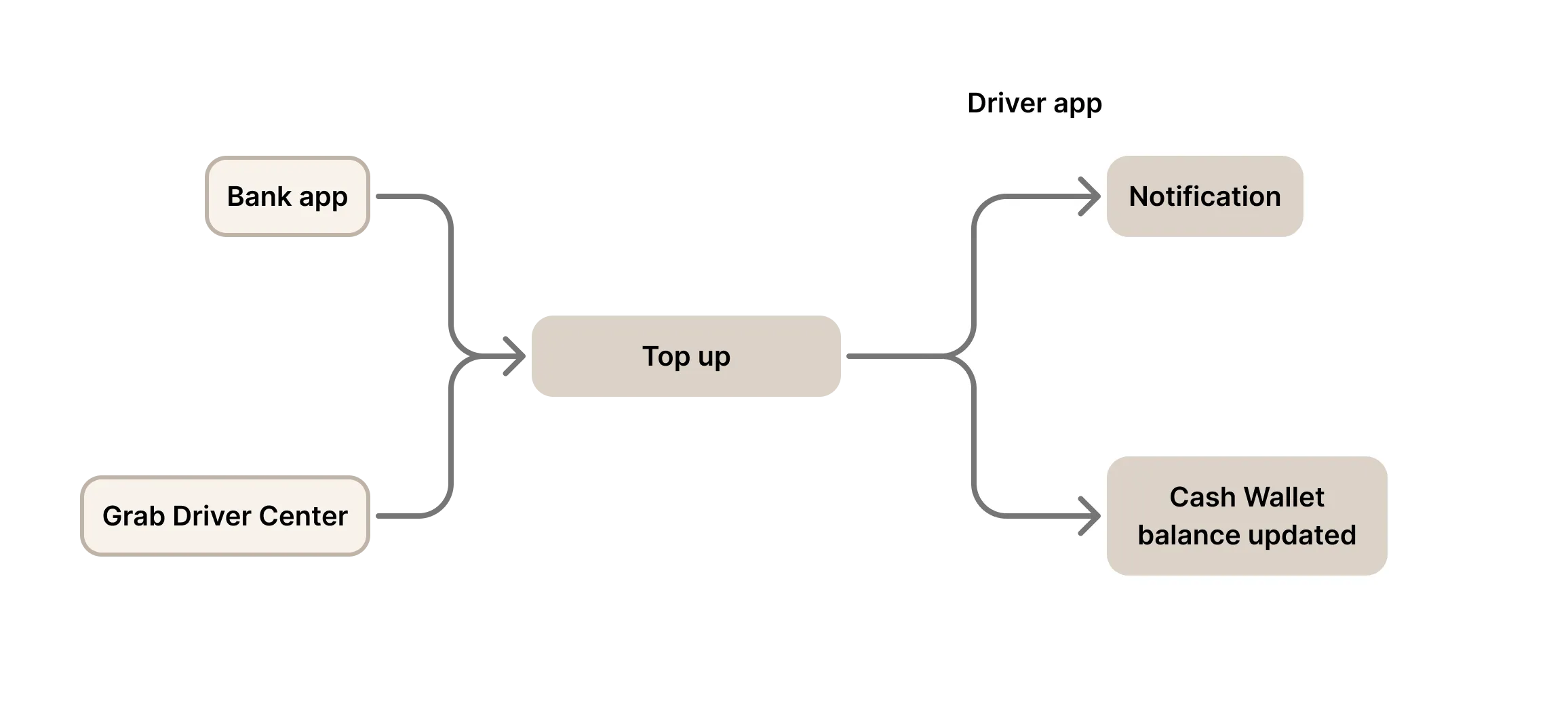
Grab pays drivers' earnings into the Earnings wallet, with automatic deductions for rental and loan fees. Drivers could top up via cash at Driver Centers or via bank transfers. The Cash-out wallet allowed fund transfers to their linked bank account.
Merging them created a Cash Wallet with both top-ups and cash-outs, making it a regulated payment account under Singapore law. SVF regulations would impose transaction and storage limits too restrictive, potentially rendering the wallet unusable.
BUSINESS CHALLENGE
How might we maintain the benefits of the merged wallet while ensuring regulatory compliance?
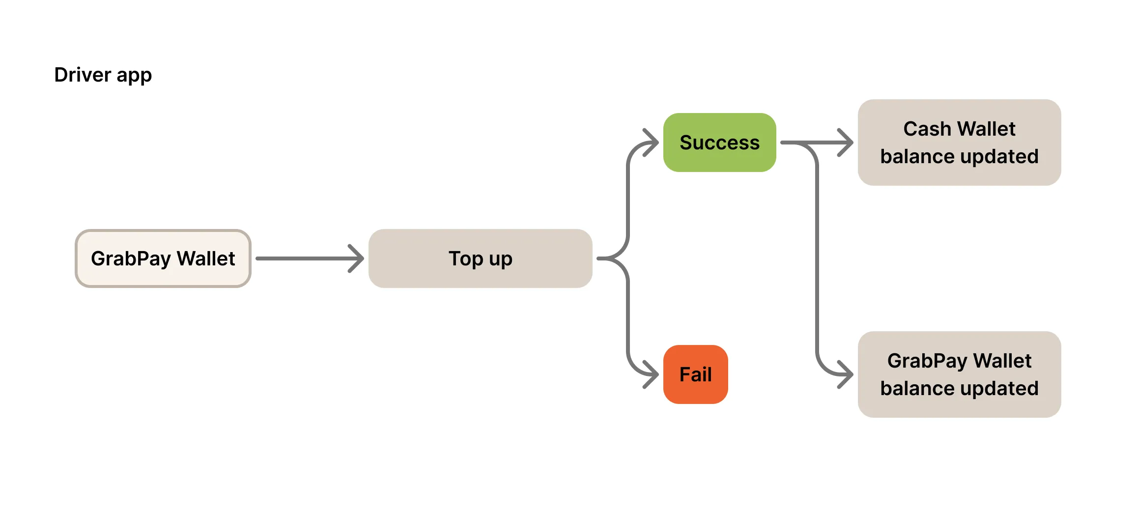
Grab can operate the Cash Wallet without an SVF license if either condition is met: all top-ups are used only for limited purposes like rental costs, loans; or only Grab-issued funds (earnings, GrabPay top-ups) can be cashed out. This gave us two compliance options:
LIMIT PURPOSE & AMOUNT OF TOP-UPS
✹ Limit top-up purposes and amounts to rental/loan payments only
LIMIT CASH-OUT OF MANUAL TOP-UPS
✹ Prevent manual top-ups (bank transfers, cash) from being cashed out
Data analysis and driver interviews revealed:
Only 2% of drivers top up manually, meaning Option B affects fewer users. Since limiting top-up purposes and amounts is complex to build and understand, we chose Option B.
Upon reviewing the existing cash-out flow, we dove into the redesign with these goals in mind:
INFORM
Inform drivers of new cash-out conditions at decision making points
UNDERSTAND
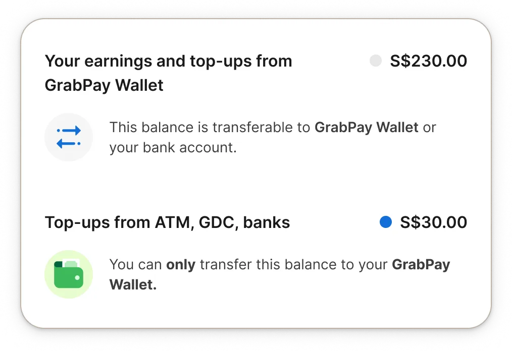
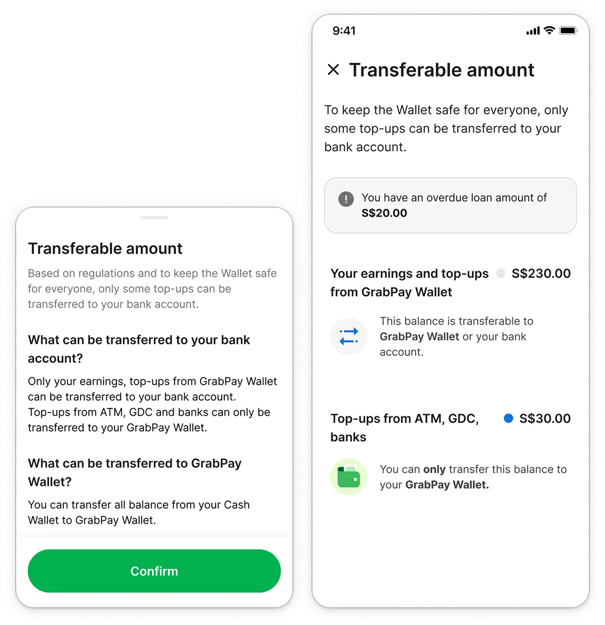
Help drivers understand the different amount of transferable balances
EXPERIENCE
Optimize the cash-out user experience, reduce friction to cash out
The ideal decision point to inform drivers about changes isn't accessible within our app.
For new features or issues, drivers turn to their network first to get updates, then escalate through "team leaders" (assigned driver mentors) to Grab.
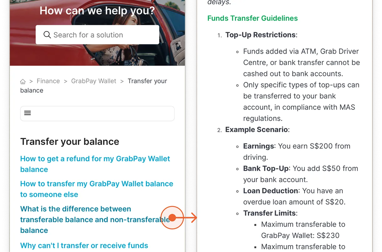
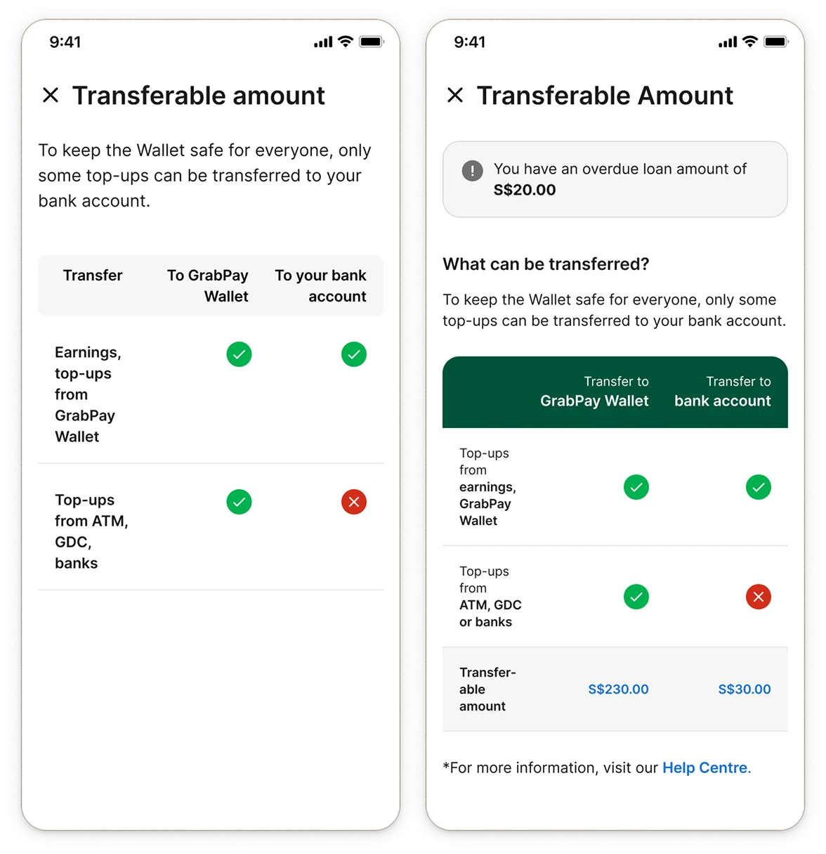
Grab's consumer app uses transferable balance for credit card top-ups that can't be withdrawn. Our Driver app were already using the term to refer to Cash Wallet balance minus any overdue loan.
To introduce another limit where manual top-ups from cash and banks cannot be cashed out could create potential confusion.

I assumed that relying on a familiar pattern would help drivers more easily grasp the concept.
I designed the first version of the dashboard, mirroring Grab's existing consumer app pattern with breakdown showing different types of balances during cash-out.

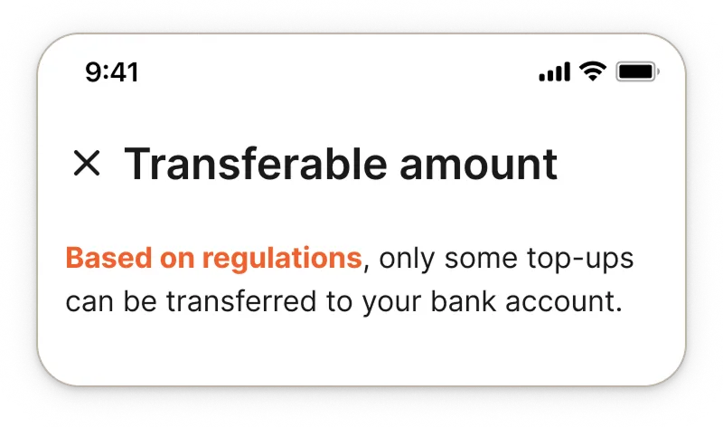
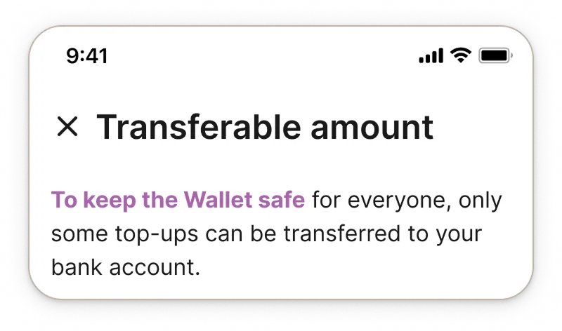
Keep simple, avoid legal jargons
Prioritize clarity over minimalism
Use positive but not casual language


We interviewed our drivers and found:
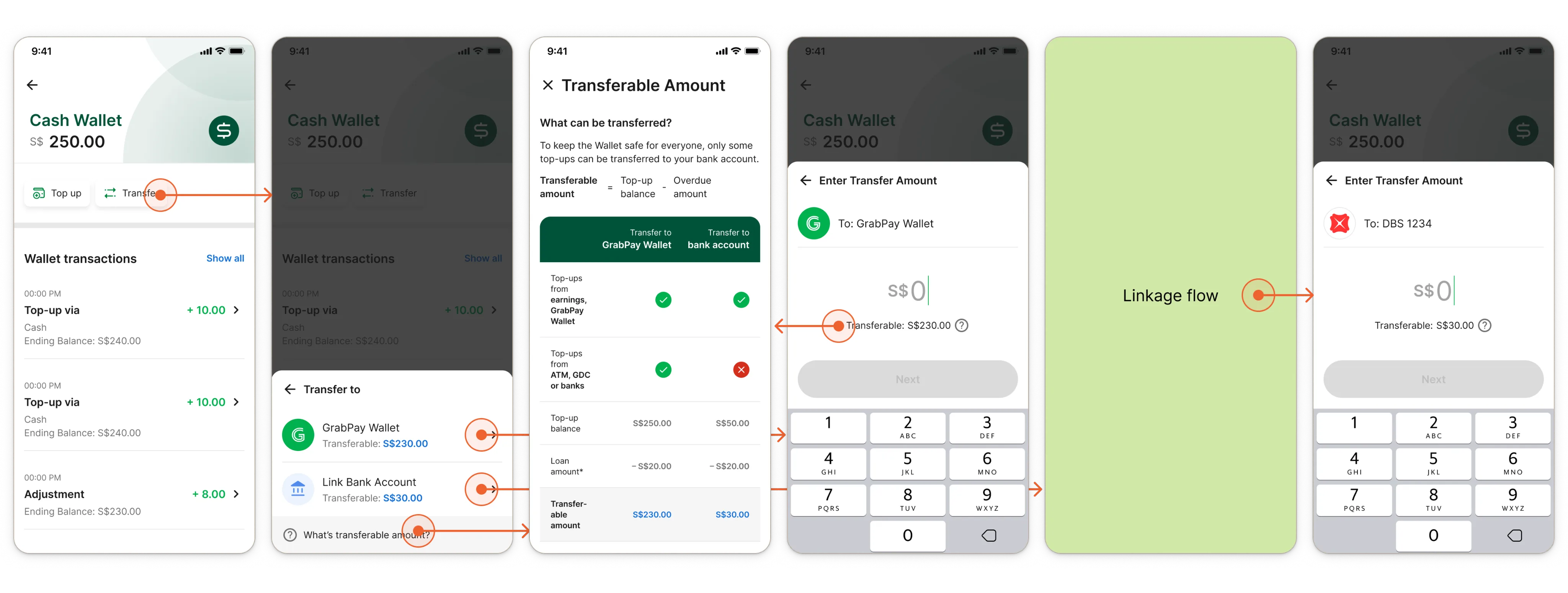
Without a research team, I set up the usability test and interviewed drivers by my lonesome. Drivers found the explanation clear, and preferred upfront balances, reduced cash-out steps, and the transparency a comprehensive dashboard provides.
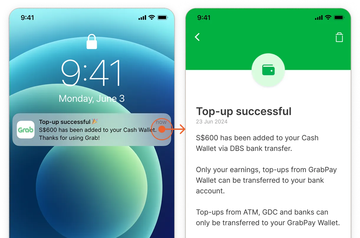
To meet urgent timelines, we successfully rolled out Help Center content followed by the remaining improvements later, enabling the team to reduce maintenance costs through wallet merger while keeping the Cash Wallet compliant.

ORGANIZATION/LEGAL
Successfully implemented wallet compliance conditions
FINANCIAL
Saved on SVF licensing and regulatory expenses
CUSTOMER SUCCESS
Positive driver testimonials on messaging
Make it compliant but user-friendly
When designing for compliance, there are many ways to tackle regulatory requirements. It's crucial to collaborate with legal, product, and content teams to identify solutions that work best for users.
Different user types have different behaviors
Grab has various user types: customers, drivers, merchants. While certain patterns like Enter Amount and Transaction History work universally, behaviors diverge around dashboards and communication channels. When designing for a new user type, it's essential to get face time and evaluate all assumptions.
