ORGANIZATION
~100%
✹ Design system coverage
PRODUCT
Increased speed of delivery and quality
FINANCIAL
~1.13M
✹ Increase in cashless users across all markets
CUSTOMER SUCCESS
Better error recovery for users
Beside improving key business metrics, elevating design quality (aesthetic, craft quality, user experience & emotional connection) was also part of my responsibilities. Through internal audit, we identified 3 problem areas to focus on:

Manual design
Designers having to recreate visually outdated screens from scratch. No design system caused poor velocity.

Inconsistent design patterns
Without an agreed upon approach to error recovery, every team created their own experience, confusing users.
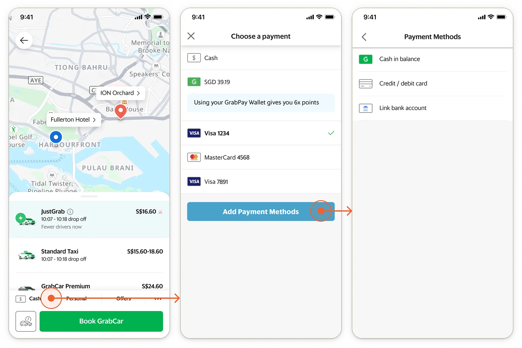
Inconsistent payment information
Payment info was different everywhere, new components introduced spawning new inconsistencies.
Lastly, in the year 2021, it was difficult to prioritize systems changes, Grab preferred small incremental improvements over large scale revamp projects.
To elevate the Grab payments design quality, we needed to achieve these objectives:
Design system
Navigate org complexity to implement the design system
DESIGN PATTERN
Unify the payment patterns across the Grab consumer app
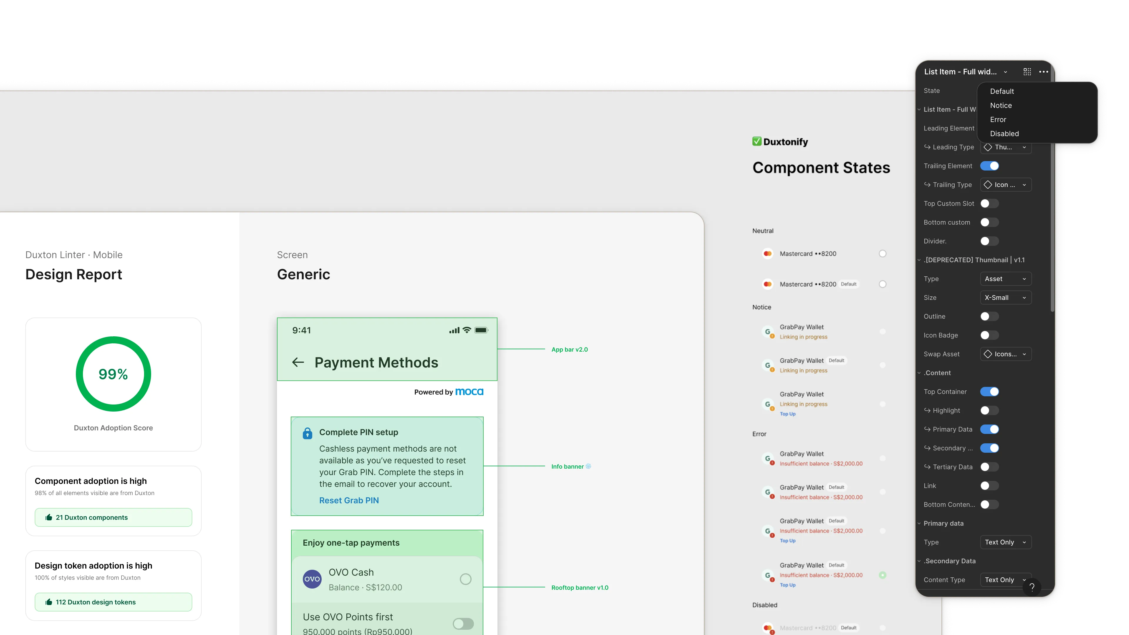
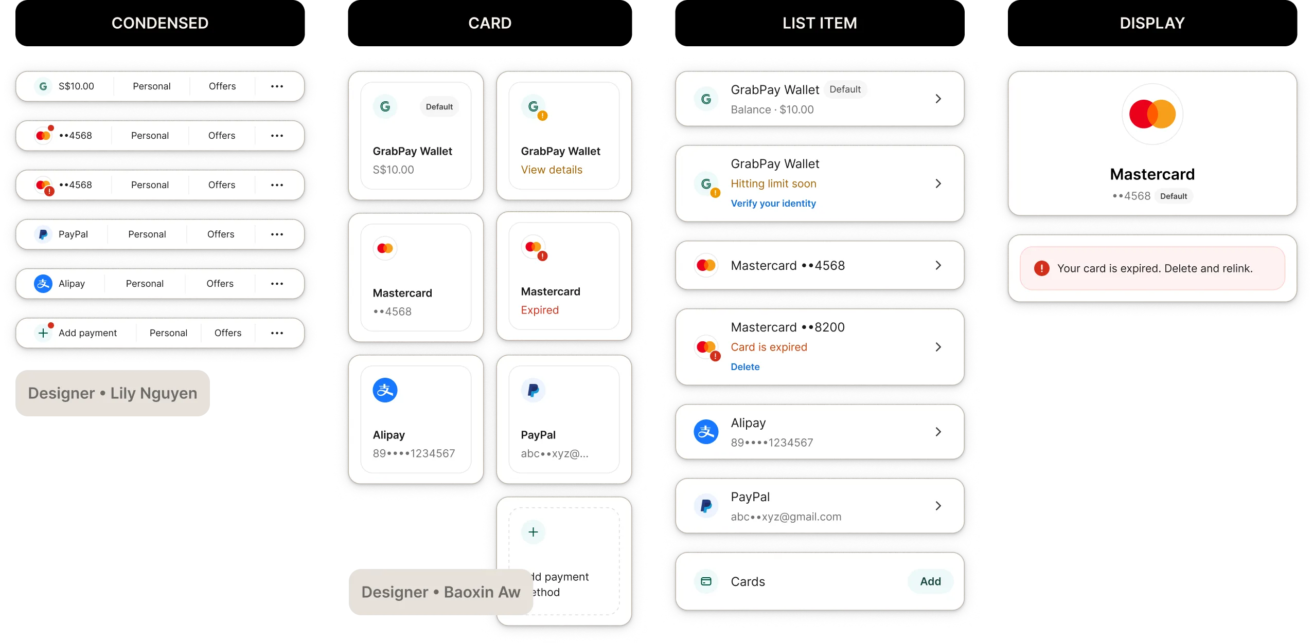
The pain of inefficiency and inconsistency got to us, we kicked off the creation of a unified design system. I led the design of the Payment Method List Item, our most used element.
We hit a snag however, design system work was not a priority, how do we get them implemented in code when we didn't have engineering resources?

In parts of the flow where I was not the owner of, I recommended experiments to improve the team's metrics. With that, more consistent UI were rolled out and the experiment also yielded positive business results.
Our team was the first to adopt the vertical contribution model, kicking off adoption across Grab.

Post +12 arduous months rolling out v1.0, Grab got a Design System team, a quality metric and a new Universal List Item pik .
The new consolidated List Item was complex. I worked with the Design System team and engineers to create a payment instance of the List Item, simplifying usage for our team.
After adapting many more components, the core payment screens achieved 99-100% Design System Adoption Score.
With the organization aligned on quality being one of our important focus of 2023, we had the opportunity to zoom out and review the entire payment flows. Amongst many options, we decided to prioritize tackling our most inconsistent flows, the error flows.
We looked at our user psychographic segmentation to draft some principles for the redesign. From the data, it was apparent that we needed to design for both convenience & hands-off relief and control & security.
THE LEAN-IN MAXIMIZER
~70–80%
✹ Users who value promos, diverse options, control/security
✹ The majority of Grab users
THE LAID-BACK SATISFICER
~20–30%
✹ Users who value simplicity, convenience, hands-off relief
✹ Big spenders
Our users also have 2 jobs on the booking flow, main job to make payment and secondary job to manage their methods.
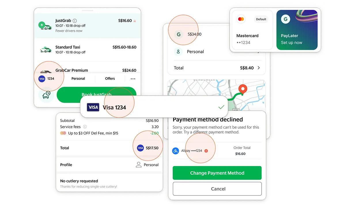
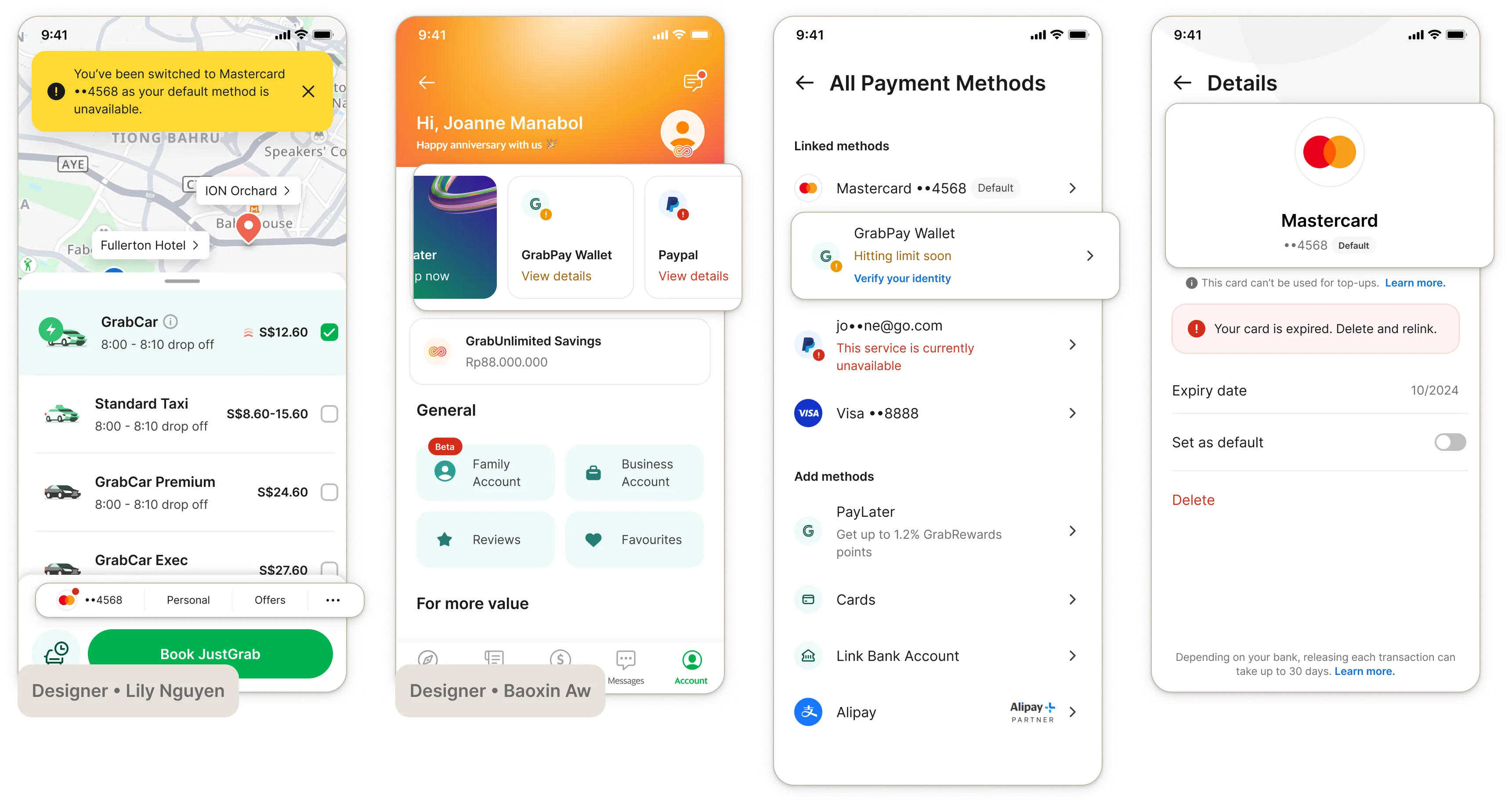
We audited the error flows and categorized the error scenarios into before and after users tap Book on the Booking screen.
Following the principle of hands-off relief, the system should always automatically recommend next available method or resolution, enabling users to make payment.
We identified 3 patterns to help users resolve issues:
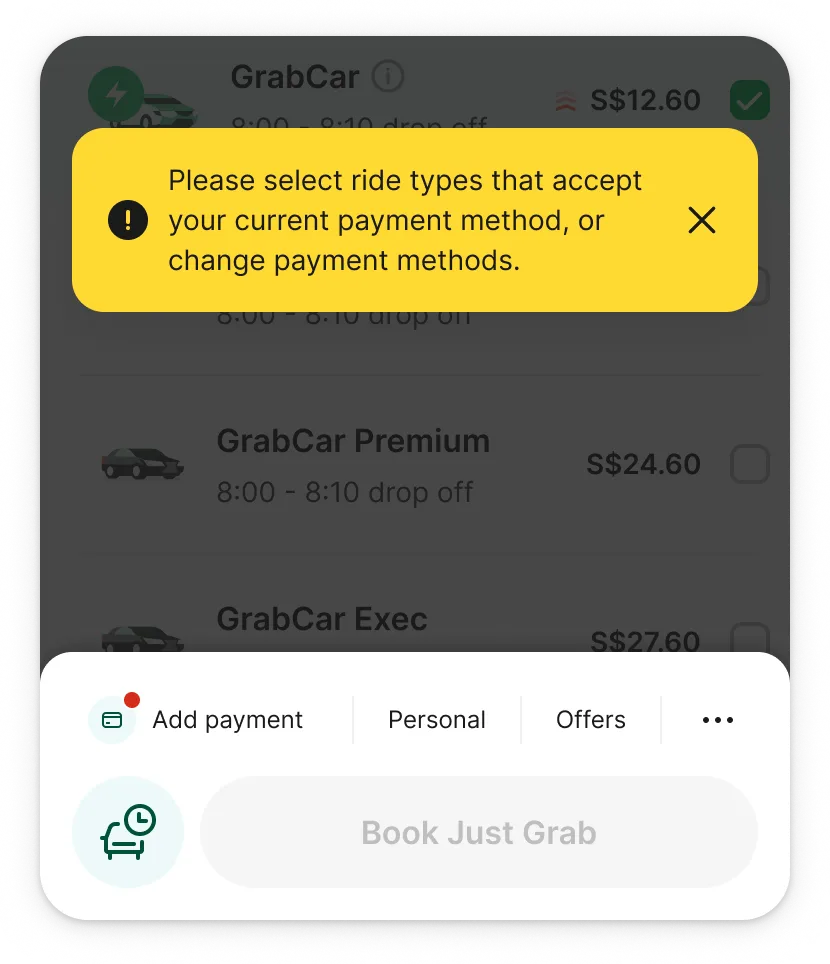


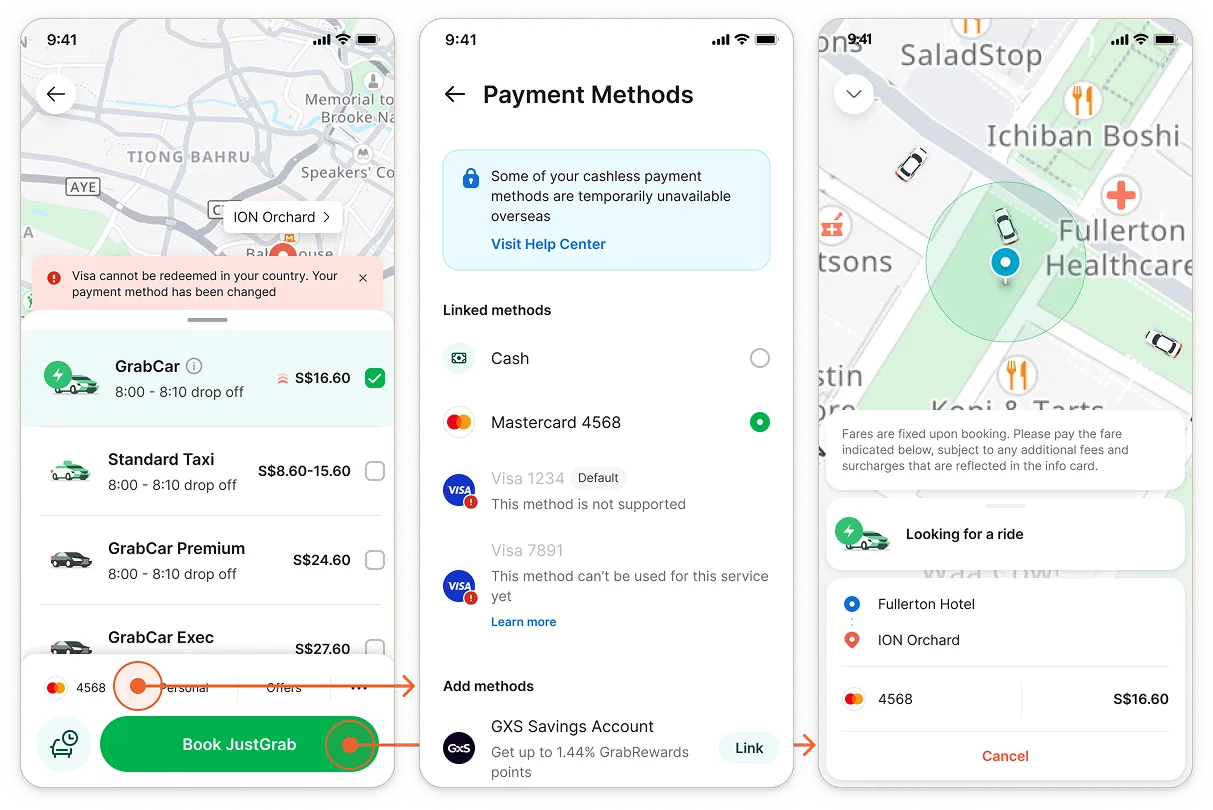
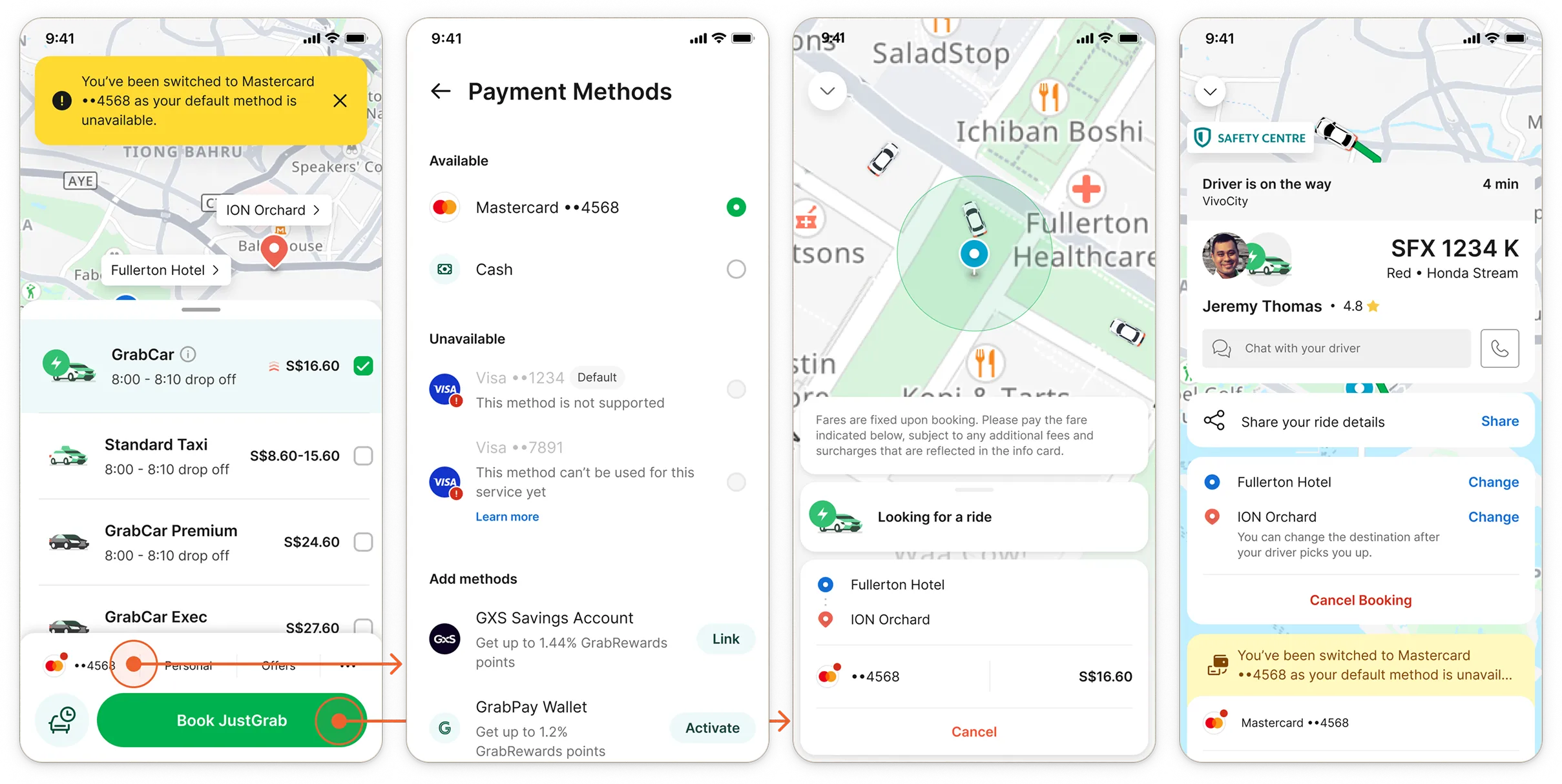
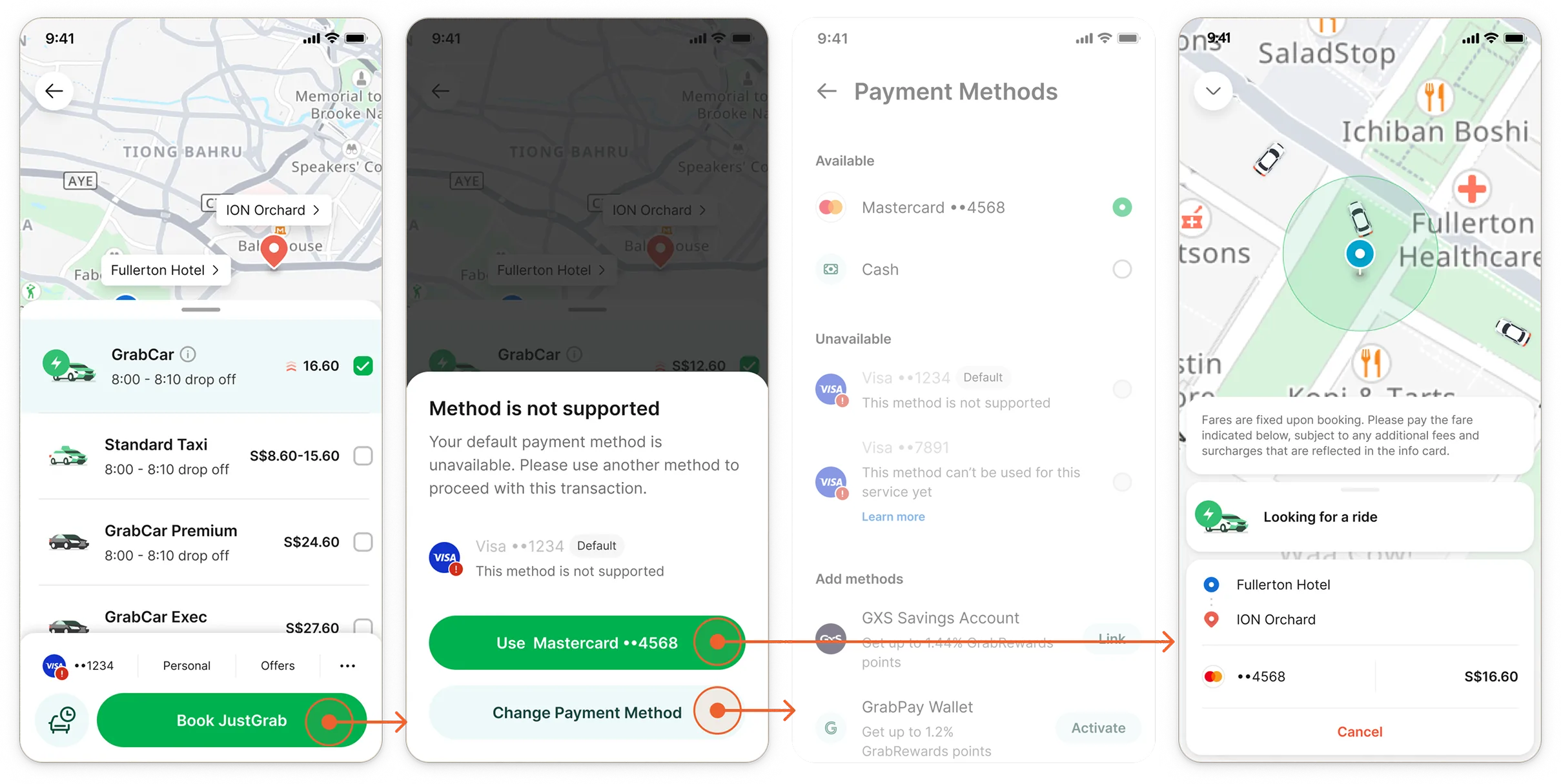
I suggested that we simplify the logic to unify the pattern further by using bottom sheet confirmation for all of the scenarios. For example:
If something happened to users' default method, the system auto fell back to the next available method.
I disagreed with the premise of auto-fallback. My manager preferred the auto-fallback experience as it provided hands-off relief. But I raised the risk of auto-fallback making our Lean-in Maximizers feel like control is taken away, and perceive the platform as unreliable.
I recommended an alternative to balance between convenience and control while also preserving the pattern of surfacing a confirmation bottom sheet:
Ultimately, we prioritized the experience for the higher value spenders for whom convenience is the most important. I suggested keeping track of drop-offs and CS tickets as guardrails.
Based on the data, many Laid-back Satisficers in Singapore don't carry cash and ~70.95% of all users only have 1 card linked. This meant many users would fall back to cash, causing frustration at the end of their ride. It is worth looking into improving this experience in the future.
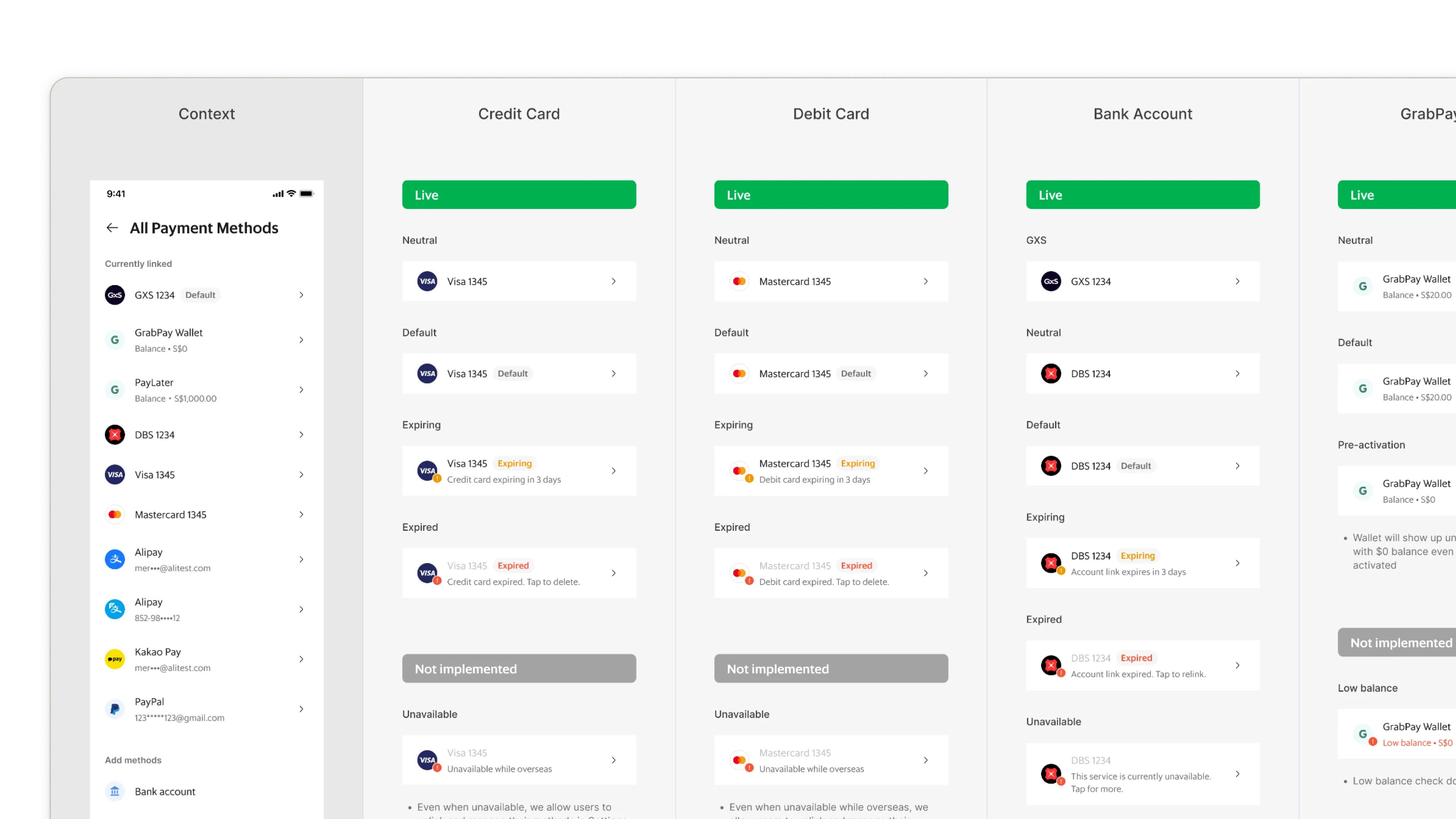
With the holistic view of the error flows in mind, I created a guideline for errors on the Payment Method Selection screen, supporting users' secondary job of managing their methods and their status.


Zooming into the details once the flow and screen patterns were identified, I led several design jams and reviews where we mapped out 4 different types of payment information, that would show up across the Grab app, ensuring the states and UI are consistent.
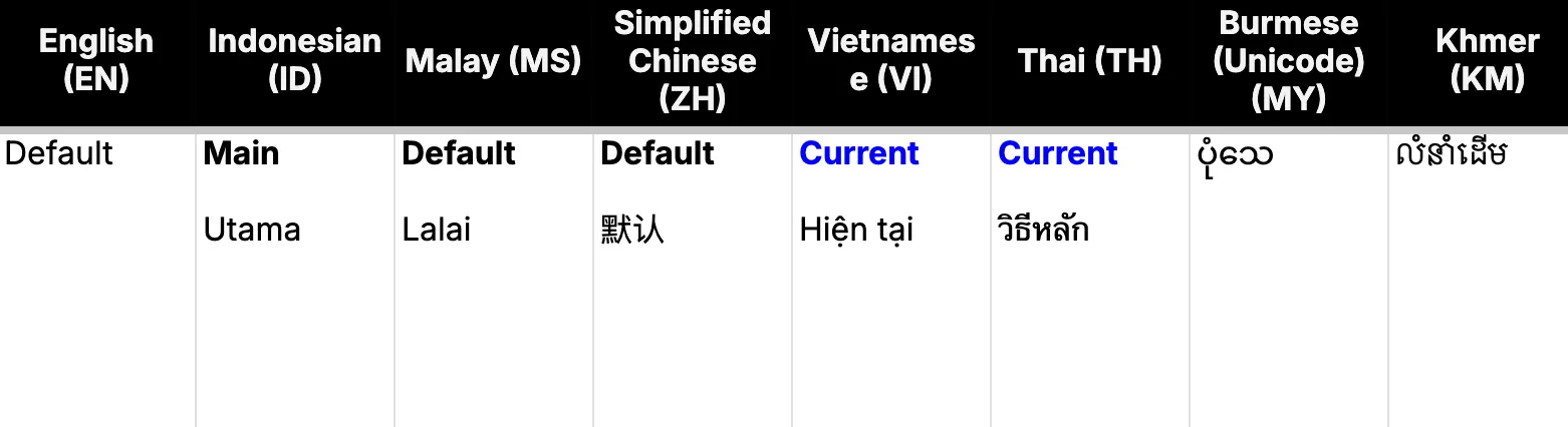
Consistency does not mean everything needs to be the same. I worked with our Content Designers to audit core payment terminologies and localize them into 7 languages. We built these into our content guidelines for components.
ORGANIZATION
~99–100%
✹ Design system coverage
PRODUCT
Increased speed of delivery and quality
FINANCIAL
~1.13M
✹ Increase in cashless users across all markets
CUSTOMER SUCCESS
Positive testimonials on improved error recovery
